

Finding the Perfect Balance Through Color
Color is much more than just an aesthetic choice. It’s a way to convey a mood and breathe life into a space. A harmonious interior is a place where the eye wanders naturally, without jarring contrasts or confusion. But faced with an infinite number of shades and possible combinations, it’s easy to feel overwhelmed. Too many colors create a cluttered effect, while a palette that’s too monochromatic can lack depth. So, how do you strike the right balance?
The 60-30-10 rule is a simple and effective principle that helps structure a color palette and bring cohesion to a space. By playing with these three proportions, you can create a natural visual rhythm that captures the eye and enhances the desired atmosphere.
Why limit yourself to three colors?
It’s not always easy to narrow down your choices, especially when you’re drawn to a wide variety of colors. However, choosing a well-balanced palette of three colors can radically transform the atmosphere of a room.
- A more restful interior: Our brains unconsciously process thousands of pieces of visual information every second. A minimalist color palette reduces mental fatigue and creates a sense of serenity.
- A natural theme: By limiting the number of colors, you give your interior a clear direction, which prevents it from looking like a cluttered patchwork.
- Better highlighting of elements: Each color plays a specific role and highlights its surroundings. A bright shade used in small accents draws the eye and creates a sense of dynamism, while a neutral shade allows the other colors to stand out more clearly.
Let’s take yellow as an example: a mustard yellow on a pillow or a vase will add a sunny, warm touch. But if used in excess, it can become overwhelming. That’s the subtlety of playing with proportions.
Understanding the 60-30-10 Rule
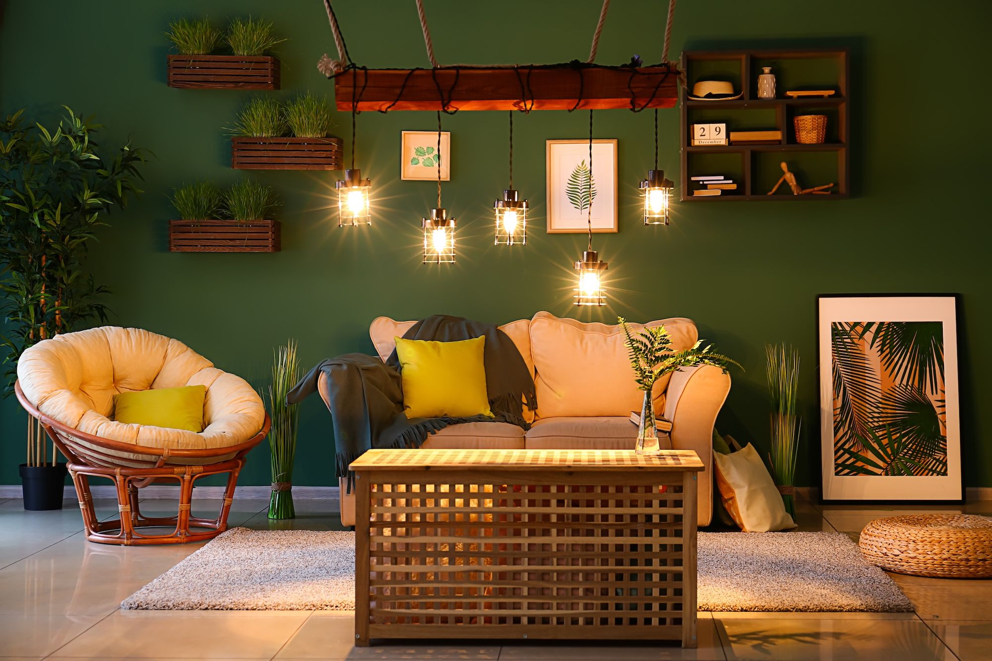
This method is based on a precise color distribution:
- 60% - The dominant color: It sets the overall tone and is used on large surfaces (walls, floors, large pieces of furniture). It should be balanced and timeless so as not to become tiresome.
- 30% - The secondary color: It enriches the color palette and adds structure to the space, often through curtains, rugs, accent furniture, or textiles.
- 10% - The accent color: It’s the finishing touch—the one that catches the eye and adds character. It’s expressed through decorative objects, throw pillows, lighting fixtures, or works of art.
Imagine a living room with sand-beige walls, furnished with olive-green linen armchairs and accented with a few deep black accessories. The overall look is soft, natural, and refined, with just the right amount of contrast to capture the eye.
Our Inspiring Color Palettes for a Balanced Interior
Contemporary Elegance

- Butter yellow (60%): a soft, warm shade that brightens up the space.
- Chrome Gray (30%): a modern and sophisticated contrast.
- Deep black (10%): for a touch of character and elegance.
Soothing Nature

- Sage green (60%): Inspired by nature, it creates a soothing atmosphere.
- Clay beige (30%): warm and organic, ideal for a cozy retreat.
- Ink blue (10%): a touch of depth and sophistication.
For minimalist luxury

- Linen white (60%): bright and timeless, it makes the space feel larger.
- Cocoa brown (30%): an earthy, enveloping touch.
- Brick red (10%): a warm, vibrant note that brings the whole blend to life.
The Scandinavian atmosphere

- Off-white (60%): a neutral, luminous base.
- Charcoal gray (30%): a subtle contrast that defines the space.
- Natural wood (10%): an organic touch that adds warmth to the overall look.
Softly Bohemian

- Light Terracotta (60%): a warm, inviting color.
- Grayish blue (30%): for a soft, slightly contrasting effect.
- Antique gold (10%): a luminous touch to enhance the overall look.
Conclusion: Harmony That Reflects Who You Are
Creating a harmonious interior is, above all, about putting together a color palette that reflects your personality. The 60-30-10 rule isn’t a restriction, but a guide to better structure your space and avoid missteps. It helps you avoid the “rainbow” effect while playing with subtle, controlled contrasts.
The key is to dare to experiment, observe how colors interact with one another, and, above all, let your instincts guide you. A successful interior is one where you feel comfortable, and where each color naturally finds its place.