

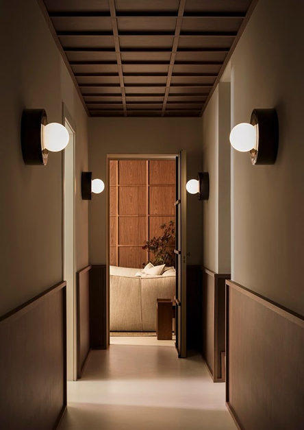
People sometimes think that all it takes to transform a room is choosing a beautiful shade. But in interior design, color never stands alone. It interacts with light, space, textures, and even… the time of day. A shade that seemed soft and soothing can quickly become dull or stifling if used incorrectly.
Here are four technical tips to help you avoid common mistakes when repainting an interior—and achieve the light, airy look you're after.
1. Always test the color on-site, not on a sample
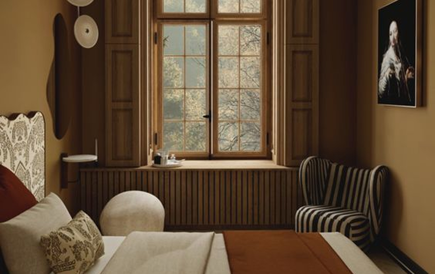
Printed color charts and online visuals are good starting points, but they are never enough to assess the true impact of a color.
👉 Must-try:Paint a square measuring at least 50 × 50 cm directly on the wall. Try it in multiple spots: a light-filled section of wall, a darker corner, and an area between two openings. This full-scale test will reveal unexpected shades of the color you’ve chosen.
🔍 Why is this important?Because white can appear bluish-gray in the north, while in the south it will look warmer and more ivory-colored. And this applies to all shades, from neutrals to the brightest colors.
2. Check the color at the right times—and under your actual lighting
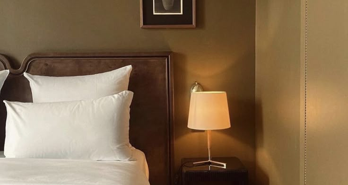
A color changes depending on the time of day. What looks soothing in the morning may appear greenish or grayish in the evening light.
🕯️ Try this:– How it looks in natural light (morning, noon, late afternoon) – And especially under your actual lighting: halogen, LED, warm or cool bulbs, spotlights, or pendant lights…
3. Choosing the right finish: matte, velvety, or satin?
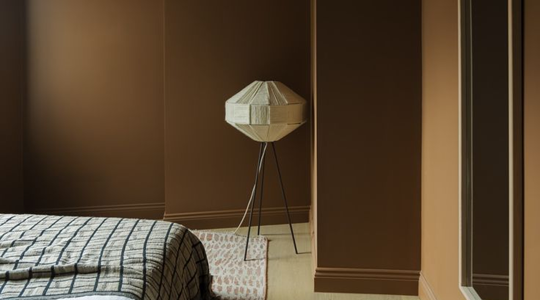
Many people instinctively choose the "satin" finish, thinking it's more durable. But it isn't always the best choice for your walls.
🖌️ Matte or velvet:– Absorb light – Hide imperfections – Create a cozy, soft atmosphere, ideal for living spaces
✨ Satin or gloss:– Reflects light – Accentuates imperfections (cracks, dents, variations in the plaster) – Best suited for very smooth walls… or for small accents (doors, woodwork, furniture)
4. Don't overlook the underlayment
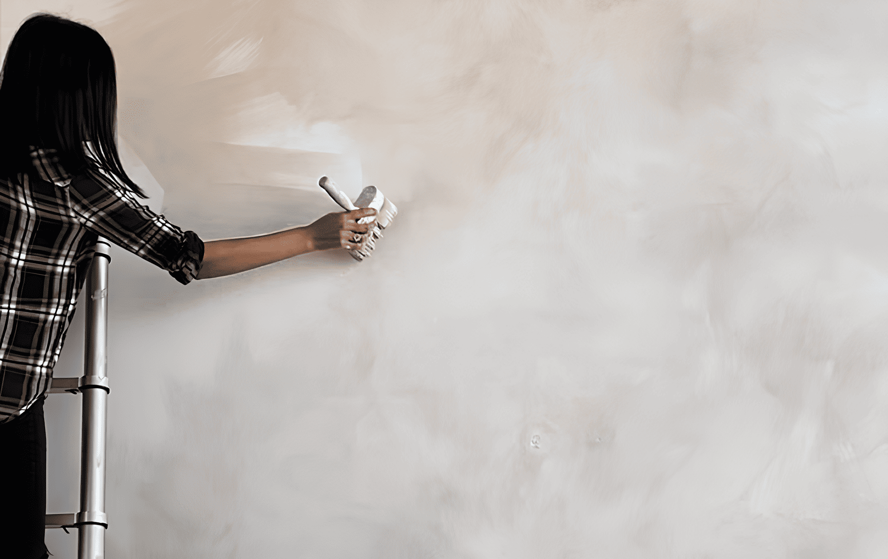
This is a step that is often overlooked—yet it is essential. A poorly chosen primer can dull the final color or distort how it appears.
🎨 Best practices:– If you’re painting a light color on a dark wall: use a tinted, opaque primer that’s close to your final color. – If your walls are new, porous, or very uneven: opt for a bonding primer for a more uniform finish and reduced paint consumption.
In summary
A beautiful color applied poorly can quickly make a room feel heavy. Conversely, a well-chosen, well-tested, and well-applied shade… can transform everything without overwhelming the space.Test, observe, and adjust. And let the light do the rest.