

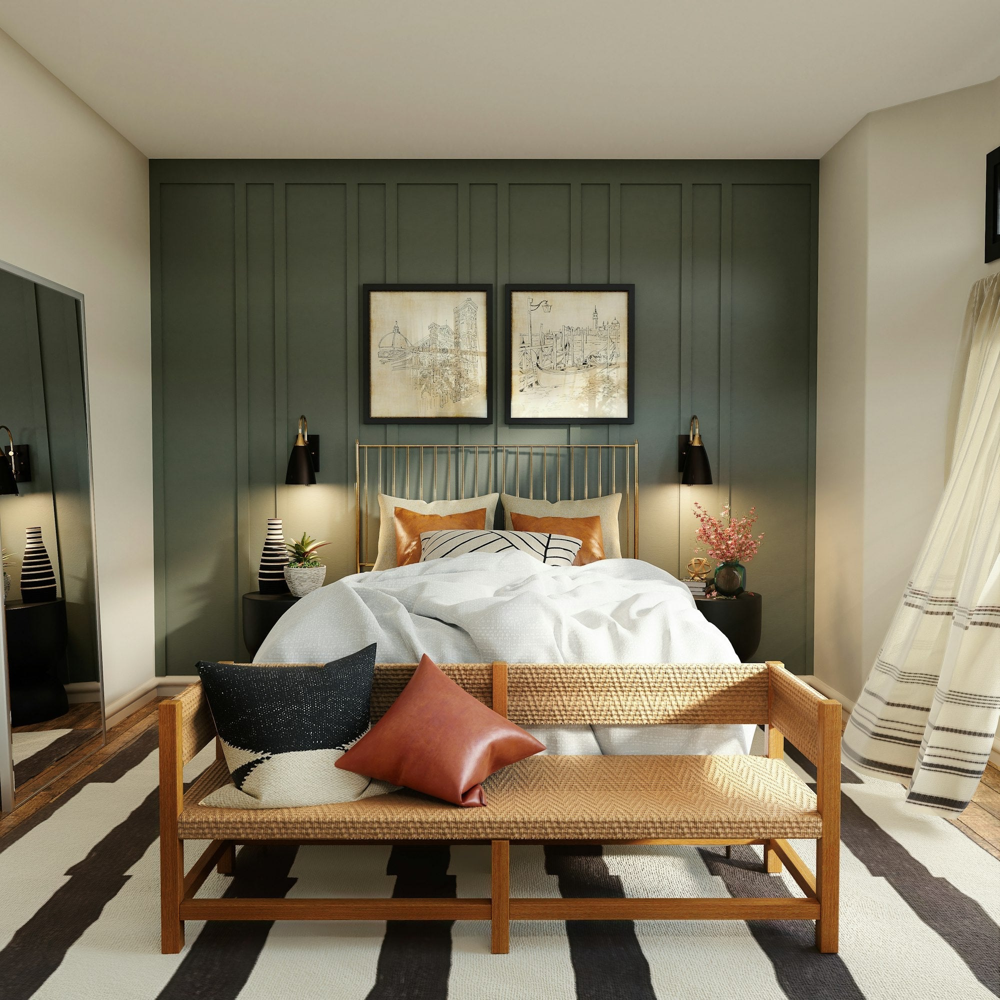
Creating a harmonious bedroom—whether it’s a master suite or a nursery—requires careful selection of furniture colors and wall paint. If your bedroom gets plenty of natural light, choosing a lighter color can make the space appear larger, while soft colors create a soothing atmosphere.
Like all colors, the ones you choose will greatly influence the atmosphere of the room. A white bedroom or a bedroom with well-chosen colors can become a true haven of peace. It’s also important to consider the types of colors that work well with a bedroom’s decor to create a pleasing visual balance.
Why is it important to choose the right paint color for a bedroom?
Choosing the right paint color for a space designed for rest is essential for creating an atmosphere that promotes relaxation. Colors have a strong influence on mood and can affect the quality of your sleep. But what’s the ideal color for a bedroom?
Neutral colors like beige or gray are often recommended because they have a calming effect. These tones can be complemented by deeper shades, such as pastel blue or soft green, which add a touch of softness. You can also choose dark colors for an accent wall to add depth without compromising the overall atmosphere.
What is the best color for a bedroom?
If you're looking to create a relaxing atmosphere, light, natural shades are your best bet. Cool colors, such as blue or light green, bring a sense of freshness and tranquility. On the other hand, shades like off-white or taupe are perfect for a cozy, comforting atmosphere.Each color should be chosen based on the room's natural light. If your space is well-lit, you can get away with adding bolder accents without making the atmosphere feel too dark.
Just as with a bright living room, choosing light shades can create a sense of space and calm.
How to Choose the Perfect Color for Your Bedroom?
Choosing the perfect color depends not only on your personal preferences, but also on the size and layout of the room. If the room is small, opt for light shades to make the space appear larger. If it’s spacious, colors like midnight blue or deep green add warmth and intimacy.
Also, be sure to coordinate the colors with your decorative elements. Decorative items such as curtains, throw pillows, and rugs should complement the rest of the walls to maintain visual harmony.
What is the best color for a Zen-inspired, relaxing bedroom?
A Zen-like atmosphere is ideal for unwinding from everyday stress. Natural shades are the best way to create this atmosphere. But what paint color should you choose to ensure this calming effect?

Colors for a Soothing Atmosphere in a Bedroom
For a serene atmosphere, choose colors like mint green or pastel blue. These shades are known for their relaxing effect on the mind. Natural materials like light wood or linen will enhance this effect.
If you prefer a cozier atmosphere, terracotta or cream tones are excellent options for adding a welcoming touch while maintaining a peaceful setting.
What kind of paint should you choose for a Zen-style bedroom?
To create a Zen atmosphere, we recommend choosing acrylic paint, which is more environmentally friendly. This type of paint emits fewer volatile organic compounds (VOCs), which helps create a healthy environment. Plus, it’s easy to maintain and provides a smooth, even finish that enhances the Zen effect.
Feng Shui and Painting Your Bedroom
This Chinese practice aims to harmonize the energies in a space. Applying these principles to your choice of colors can improve the quality of your sleep while balancing the energies in the room.
It doesn't just apply to paint colors, but also to the orientation of your bed, which can also improve the quality of your sleep.
The Definition
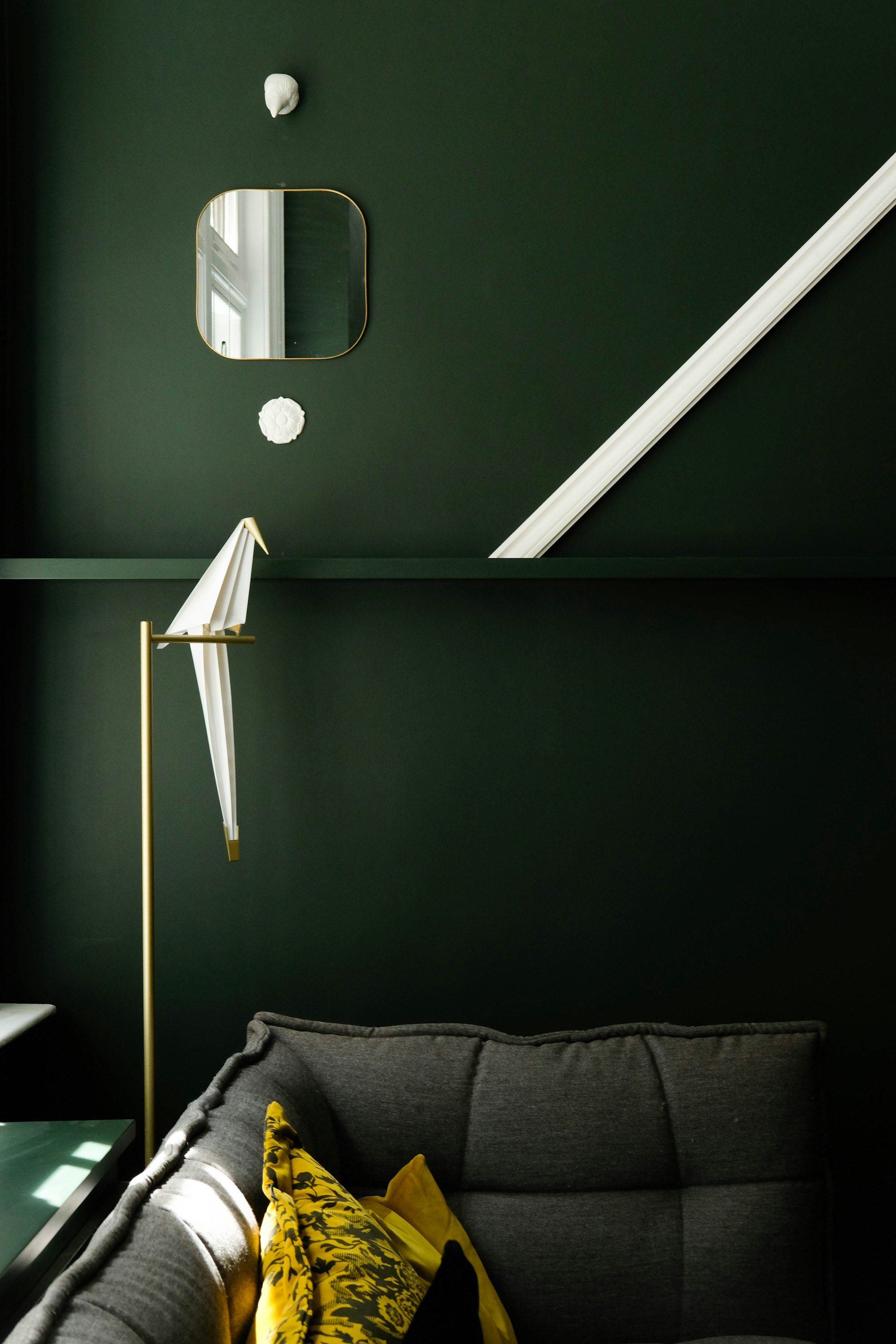
Feng Shui focuses on the flow of energy within a room. According to this philosophy, every color has an impact on the energy of a space. Blue and green symbolize tranquility and growth, while brighter colors like red are often avoided because they overstimulate the senses.
How can you apply these principles in a bedroom?
According to this philosophy of life, it is recommended to avoid overly bright colors in a room intended for sleep, as they disrupt balance. Neutral tones, such as off-white or light gray, are preferable for promoting rest. Use pops of color in strategic areas, such as throw pillows or artwork, to balance the room’s energy.
Colors to Avoid for a Good Night's Sleep
Some colors, although pretty, can interfere with the quality of your sleep. It is therefore important to be aware of them so you can avoid using them in a bedroom.
Colors That Are Too Stimulating and Should Be Avoided in a Bedroom
Bright colors like red or orange can stimulate the mind rather than soothe it. While these colors are often associated with vitality, they are not suitable for a rest area because they prevent complete relaxation.
Why aren't bright colors suitable for a bedroom?
Colors that are too intense increase mental activity, which can make it difficult to fall asleep. For this reason, they are better suited for spaces such as the living room or kitchen, where visual stimulation is more desirable. In a bedroom, it’s recommended to choose cool or neutral colors to ensure a good night’s sleep.
Paint, Master Bedroom, and Color Schemes for a Child's Room
The color scheme in the master bedroom should convey both comfort and harmony. Combining light and dark colors helps create a serene atmosphere. Using two complementary colors or choosing a different color for the furniture can also add a touch of personality.
Combining Colors in the Master Bedroom
In an adult space, striking a balance between soft hues and bolder shades is essential. A subtle combination of colors can transform the room into a space that is both relaxing and elegant.
How can you coordinate colors in a master bedroom?
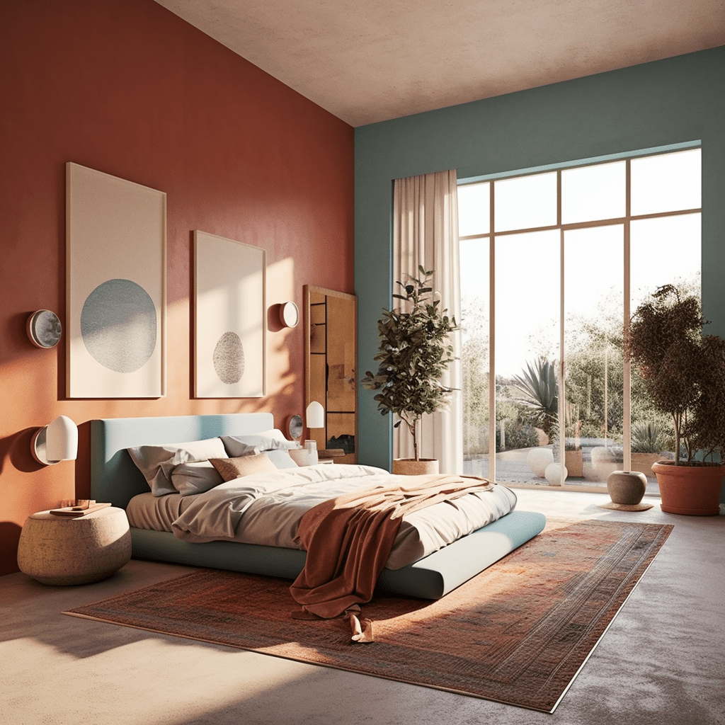
Color coordination is key to creating a harmonious atmosphere. To avoid visual clutter, it’s best to combine neutral tones—such as pearl gray or beige—with bolder accents, like navy blue or olive green. These shades create a serene and elegant setting, perfect for a peaceful environment.
You can also add accents of natural wood or linen to enhance this soft, cozy atmosphere. The color scheme also provides an opportunity to incorporate natural materials that create visual balance and a warm, inviting setting.
Paint Colors for a Cozy Atmosphere
If you’re looking for a cozy, warm atmosphere, opt for shades like terracotta or taupe. These shades add a warm, inviting touch without making the space feel heavy. For an even cozier feel, you can use textile accessories—such as throws or wool pillows—which will perfectly complement walls painted in soft tones.
What color should a child's bedroom be?
Creating a playful atmosphere that soothes a child is a delicate task. It is important to strike a balance between stimulating hues and calming colors that promote rest.
How do you find the perfect color for a child's bedroom?
For a child’s bedroom, opt for pastel colors, such as sky blue, powder pink, or soft green. These shades have the advantage of stimulating creativity while providing a relaxing environment. To liven up the space, you can incorporate small touches of brighter colors, such as an accent wall or colorful accessories.
The Right Colors to Promote Rest in a Child's Bedroom
The best colors for promoting sleep are often soft, cool shades, such as pastel blue or aqua green. These shades create a relaxing atmosphere, ideal for promoting rest. Combining these colors with decorative elements made of wood or cotton helps enhance the natural, calming effect.
To complement the color of the walls, choosing bedding in natural shades, such as beige or white, enhances the room’s calming effect.
What type of paint is best for a bedroom?
Choosing the right paint is just as important as choosing the right colors. High-quality paint not only ensures an attractive finish, but also helps maintain a healthy environment. But which paint should you choose for this space?
Painting a Room: Tips and Recommendations
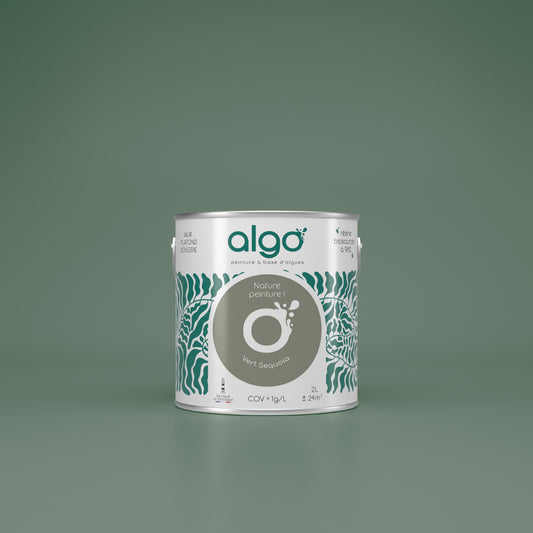
When painting a bedroom, it’s best to choose a paint with low levels of volatile organic compounds (VOCs), such as acrylic paint. This type of paint is not only environmentally friendly, but it’s also durable and easy to maintain. By applying several thin coats, you’ll achieve a smooth, even finish.
What are the differences between cool and warm colors for a bedroom?
Cool tones evoke a sense of freshness and calm. They are ideal for spaces designed for relaxation. Sky blue, for example, is known for its soothing properties. In contrast, warm tones, such as terracotta or beige, add warmth and a sense of coziness.
The choice between these two options will depend on the atmosphere you want to create. If you prefer a more intimate and cozy space, warm tones are the way to go. For a more refreshing effect, opt for cool colors.
Trendy Color Ideas for a Bedroom
Current interior design trends favor natural, muted tones while adding a touch of modernity. But what paint colors are in style this year?
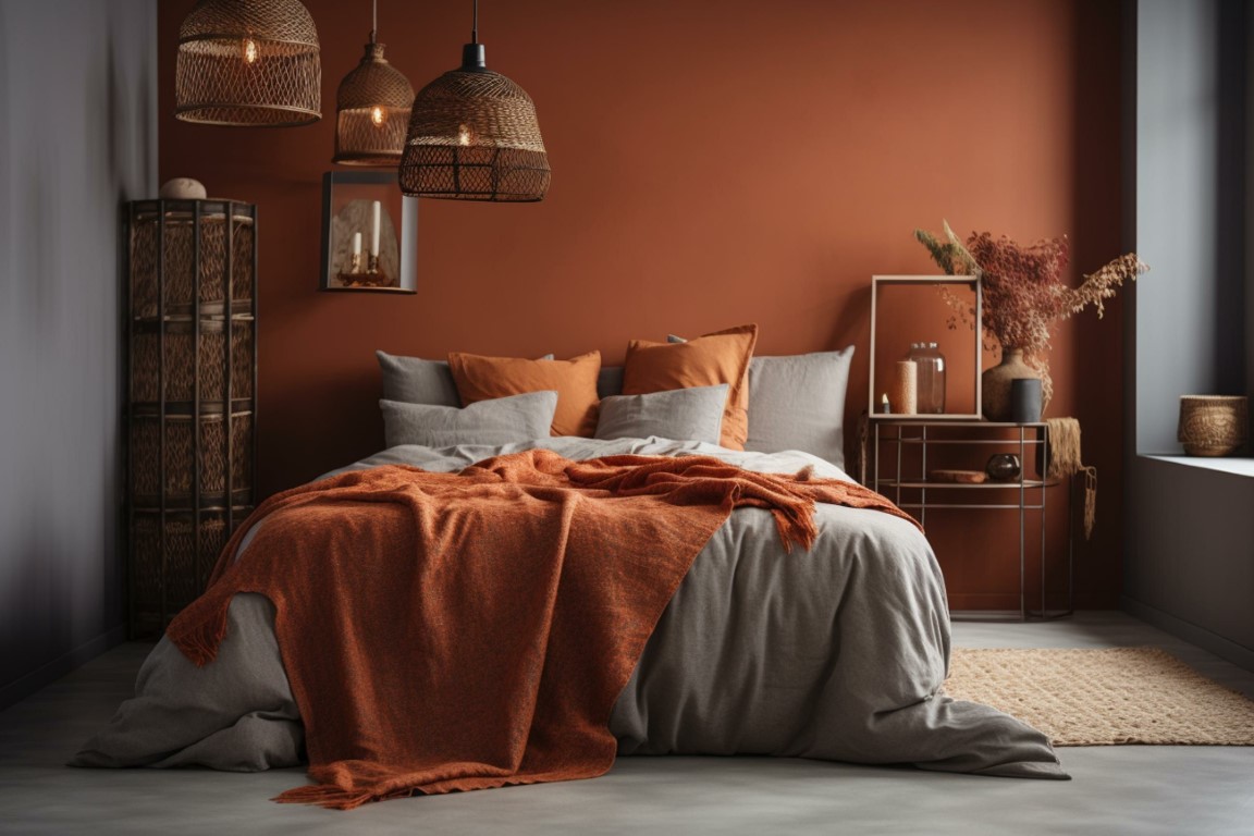
Trendy Colors for a Master Bedroom
This season’s colors highlight organic shades, such as terracotta, beige, and olive green. These shades bring warmth to a space while remaining understated and modern. Off-white also remains a timeless choice for those seeking a bright and minimalist atmosphere.
These shades can be paired with wooden or linen accessories to create a warm yet contemporary atmosphere. If you're looking for a bolder look, you can also incorporate pops of vibrant colors, such as navy blue or deep green, for an elegant contrast.
How can you combine colors to create a modern look?
Pairing neutral tones with bolder accents is an excellent way to achieve a modern and sophisticated look. The combination of off-white and midnight blue, for example, creates a setting that is both elegant and dynamic.
Using a color palette based on natural tones and materials such as wood or linen creates a modern and relaxing atmosphere. Playing with contrasts using colorful accessories, such as throw pillows or curtains, adds energy to the room while maintaining overall harmony.
Conclusion
Choosing the perfect color for your relaxation space requires careful consideration, as colors influence not only the ambiance but also the well-being of those who spend time there. Whether you’re aiming to create a Zen-like, warm, or energizing atmosphere, it’s essential to pair shades effectively and choose high-quality paint. By following these recommendations, you can transform your space into a serene and pleasant place to relax.