


When Color Becomes an Inner Language
Creating a soothing interior is sometimes less a matter of style than of balance. And more and more interior designers are finding that balance in a subtle, almost musical approach: working with monochromatic color schemes.
Derived from the Italian word “cammeo,” the term originally referred to a chiaroscuro painting technique before becoming a term in interior design. Today, it refers to the art of creating a range of shades from a single color—from the palest to the most intense—by slightly varying the saturation and brightness. A sandy beige, a grayish linen, an amber brown: all stem from the same base, but are rendered at different intensities.
The effect is striking in its simplicity. Contrary to what one might think, limiting one’s color palette isn’t restrictive—it’s liberating. It enhances visual coherence, soothes chromatic tensions, and creates a sense of unity that softens the space.
In a world saturated with stimuli, this minimalist approach resonates with a need for calm. According to a study conducted bythe American Psychological Association, a visually orderly and cohesive environment reduces perceived stress and improves concentration by more than 20 percent in both homes and offices. Choosing a monochromatic color scheme, by soothing the eye, contributes to this sense of well-being.
Part 1 – One Shade, a Thousand Variations

Working with a monochromatic color scheme starts with making a bold choice: selecting a base color. It could be a grayish blue, a sage green, a soft ochre, or a subtle terracotta—a shade that already evokes a certain atmosphere.
Building on this foundation, we expand on it:
In terms of lightness: from nearly white to the darkest shade.
In terms of saturation: more or less dense, pigmented, or muted.
Common uses: wall coverings, textiles, furniture, and accessories.
Let's take a concrete example: a color scheme centered on earthy brown.
On the walls, an off-white hue with warm undertones sets the tone.
Textiles are dressed in sandy beige or light hemp—on curtains, pillows, and a bedspread.
The furniture adds depth: a dark walnut table, a shelf made of unfinished wood, and a caramel-colored velvet armchair.
Finally, decorative items add the finishing touch: a chocolate-colored stoneware vase, an aged leather picture frame, and a fired ceramic lamp.
At every stage, harmony depends on consistency: each nuance is different, but never dissonant. These are variations on the same melody.
But it’s not just about color. In a well-executed monochromatic scheme, light plays a crucial role. The same shade can look radically different depending on the direction of the light (north or south), the time of day, or the intensity of artificial light sources. That’s why professionals always test their choices under real-world conditions, on large solid areas, observing how they look at different times of day.
Part 2 – Textures with Nuance: When Textures Take Center Stage
In a monochromatic setting, the colors interact gently with one another. But it is the textures that bring depth to this interplay.
Because if all the shades are similar, with no variation in texture, the space can quickly feel flat. The eye then looks for points of interest elsewhere—and it is the materials that capture its attention.
Washed linen reflects light in a matte, diffused way, whereas corduroy absorbs light deeply. Looped wool creates volume, whereas raw ceramic introduces a subtle, mineral-like tension. Even within a palette of beige or greige tones, these subtle contrasts are what give the design its richness.
🎨 A little golden rule from interior designers: in a monochromatic color scheme, you need at least three different textures to bring it to life.
For example, in a living room decorated in sandy tones:
The natural cotton sofa provides a soft and stable base.
A textured wool throw adds a cozy touch.
A coffee table made of raw solid wood anchors the whole look with character.
Add a jute rug, a few woven baskets, a washi paper lamp… and you’ll have a space that’s both soothing and lively.
Visual harmony thus arises as much from tone as from texture.
Part 3 – Creating a Monochrome Palette: Method, Pitfalls, and Stylistic Variations

The success of a monochromatic palette is no accident. Even if the result seems intuitive, the process itself is based on a well-defined structure.
The 3-5-1 Method
Interior designers have a simple rule:
3 main shades from the same color family.
5 key elements that feature these colors (wall, sofa, curtains, rug, furniture).
1 accent color—slightly deeper or cooler/warmer—used sparingly (vase, pillow, picture frame, etc.).
This method allows you to maintain a seamless, cohesive look while avoiding the dullness of a decor that’s too tone-on-tone.
Pitfalls to Avoid
An unbalanced monochromatic color scheme can quickly become monotonous. Here are the pitfalls to avoid:
Too little contrast: a room that’s entirely beige, with no distinct shades or textural variations, quickly looks dull.
Lack of a focal point: In a monochromatic palette, the eye needs a point of reference. A bold texture or a darker accent can serve this purpose.
Neglected lighting: A color may take on a grayish or unpleasant ochre hue depending on the lighting conditions. Always test under real-world conditions.
And what about different styles?
A monochromatic palette works well in any setting. Here are a few inspiring examples:
Wabi-sabi style: a palette of warm grays, dusty whites, and light ochre. Raw materials (clay, linen, weathered wood), irregular shapes, and meditative simplicity.
Scandinavian style: a color palette centered on white, cream, and pearl gray. Light-colored wood, soft textiles, and abundant natural light.
Bohemian style: shades of terracotta, ochre, and tea-colored pink. A mix of natural fibers, handcrafted weaves, and vintage finds.
Chic contemporary style: a palette of deep blues and muted greens, featuring velvet, weathered metal, and smoked glass.
🎨 And at Kipli? Working with a monochromatic color scheme is at the heart of our approach: a solid walnut or light oak bed, paired with beige or clay-colored linen bedding and cream-colored organic cotton pillows… A natural palette that’s pleasing to both the eye and the touch.
Conclusion – The Serenity of Sister Colors
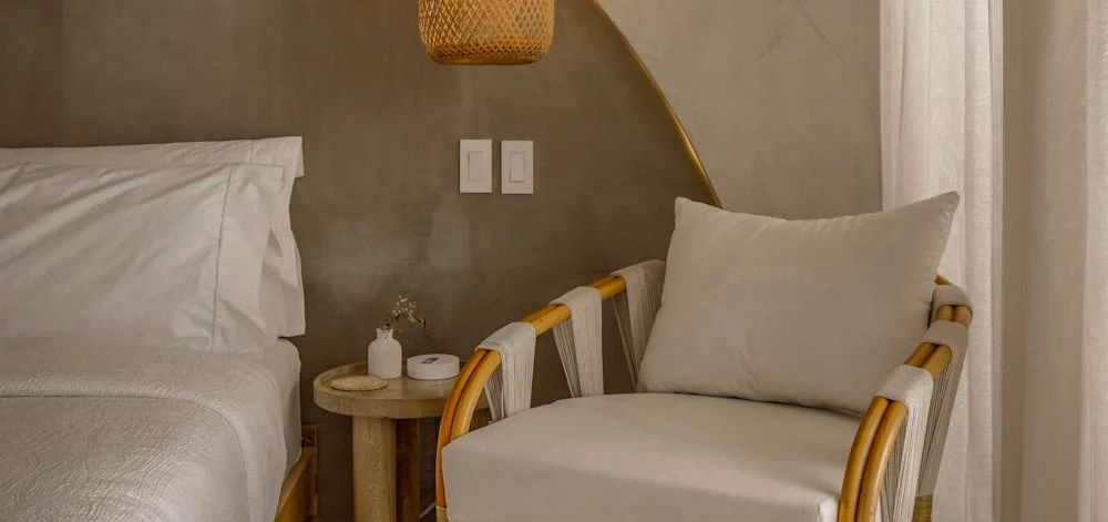
In a fast-paced world, there is something deeply reassuring about choosing a single shade and listening to it whisper in a thousand forms. A monochromatic palette isn’t a constraint—it’s a breath of fresh air. It’s a way to sort through things, get back to the essentials, and keep only what resonates.
Creating a monochromatic palette in your home is about more than just harmonizing colors. It’s about crafting a space that reflects who you are, full of subtle nuances. A cozy refuge where materials speak for themselves, where light flows freely, and where every detail matters—without ever taking center stage.
Sometimes, it doesn't take much to transform a space. A carefully chosen shade. A subtle variation. And the visual stillness that settles in like a promise of peace.